The power of colour in interior design is undeniable and it has the ability to impact a space in both physical and emotional ways. From visually raising a ceiling height, to evoking a specific mood, getting creative with the application of colour in your interior is a powerful tool in driving a design. We are going to outline just a few of the ways you can use colour to manipulate a space and hopefully inspire an upcoming design while we’re at it!
1. Making A Space Look Larger Without Resorting To White:
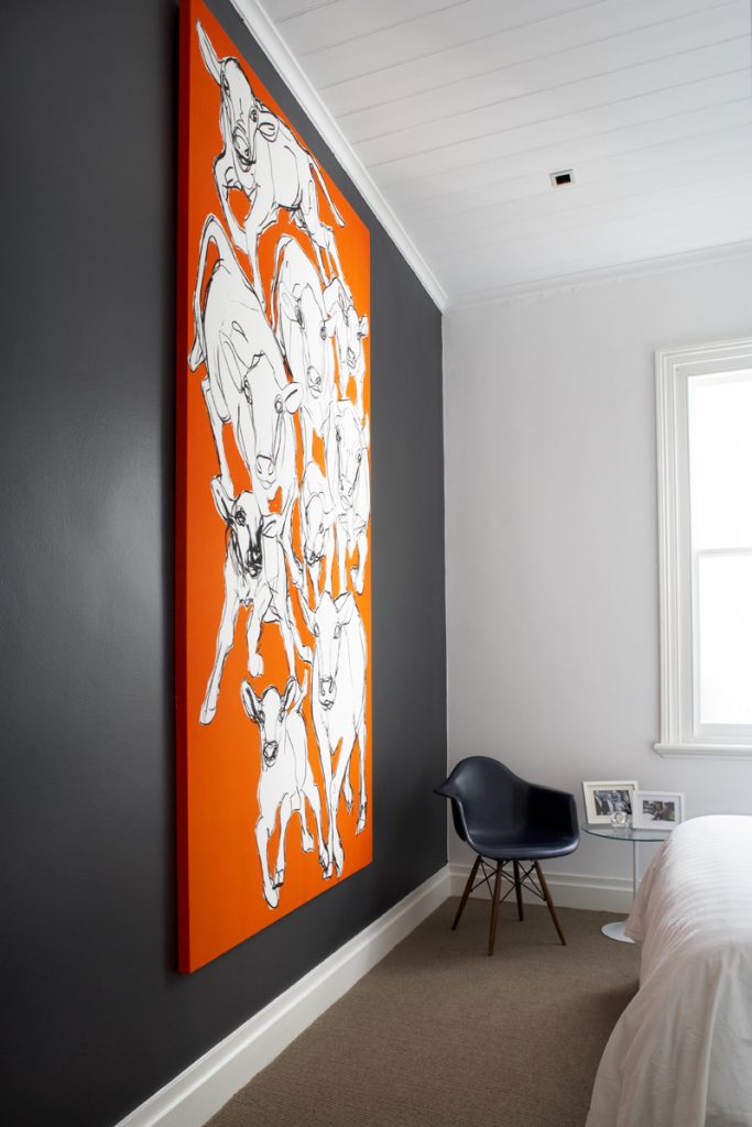
You might think that in order to achieve the light, airy feel in your space that you have to paint all the walls stark white. However, dark accent colors such as navy, gray or red can make a space look larger when they are used to create an accent wall. Painting an accent wall in a dark shade visually pushes it backward, giving the room a greater sense of depth and space. In our Clovelly Residence project, we incorporated an accent wall in our client’s bedroom to visually manipulate the space and create a grounding backdrop for one of their favourite artworks.
If you want to go with an all-encompassing colour but are worried about the effect the colour will have on the size of the space (making the space feel too small or claustrophobic), there are other beautiful hues to choose from. Some of our favourites include Dulux Polished Pebble and Dulux Spearmint, which are stylish alternatives to white that will help you achieve the spacious look you are seeking.
Aside from the colour itself, the way colour is applied to a wall, floor, cornice, or ceiling can impact a space in profound ways. For example, by painting your ceiling a lighter colour than the walls, you will visually raise the apparent height of the ceiling and create a more open feel. Another quick tip for small spaces is to paint adjoining rooms the same colour. By doing this, the eye keeps moving from room to room and judges the space as being larger than it is.
2 Create A Focal Point:
There are a handful of ways that colour can be used to create a focal point in an interior and help draw attention to a specific area of interest or even help detract from an area you are looking to disguise. Accenting your shelving and display cabinets through the application of colour is an effective way to make the shelf pop and while also providing a defined space for the items that you plan to display – from beloved treasures from past travels, to family photos or a prized art collection. To do so, you can either continue the wall colour along the back of the shelving unit or use an accent colour solely within the shelving unit.
Another way to experiment with creating a focal point is by creating a feature out of your fireplace. A fireplace is a big draw for any house hunter looking for a place with character, but sometimes injecting new life into this architectural element can completely transform the room. Playing with unique paint and tile applications is a simple yet impactful way to add personality to your space and elevate your interior. Try using a feature colour on the mantle or tiling the face with bold statement tiles.
3. Colour Blocking:
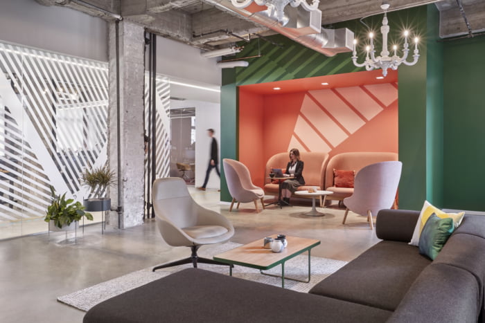
Colour blocking is an effective way to visually zone off open-plan spaces without disturbing the flow of the space with solid structures, dividers or walls. One way to zone your space is to use contrasting colours to define zones that are intended for different uses. This approach is often used in open-plan workspaces, as it enables cross-collaboration amongst coworkers while still providing a sense of structure to different teams and office space functions. Playing with colour blocking of walls, storage space, flooring, and ceilings allows for infinite possibilities when it comes to creating a truly unique, functional, and inspiring space.
Colour blocking can also be used to help break up a vast white room or wall of white appliances and add interest to an otherwise unmemorable space. This has become a popular trend in kitchen design, as many people are looking for ways to add excitement to their all-white kitchens. You can limit the colour to the base or upper cabinets or apply it to a handful of each to create a truly personalised design.
4. Evoking Emotion:
At More Than Space, all our designs are rooted in emotion. When approaching each project, it’s important we consider the way an individual will experience the space and the ways in which we can control the emotional outcome associated with our designs. One way to do so is through experimenting with various applications of colour. From paint to soft furnishings, the emotional impact of colour has a profound impact on every design decision.
The science behind colour psychology is incredibly in depth, but there are a few key takeaways to keep in mind when it comes to understanding the psychological effects of colour and how it can impact the way people experience a space. It’s important to start by defining the emotion you want to evoke in an interior – are you aiming for a moody, relaxing space, or an energizing, inspiring one? These factors will have a big impact on the colours you choose to incorporate into your designs.
Below are some of the universal emotions associated with various colours that can be used to influence a scheme:
Red – emotes feelings of energy, strength, power, determination, hunger, passion, desire, and love.
Use red in the following ways:
@home: Workout area: Red boosts energy, vitality and physical endurance. Too much can make you feel irritable, impatient or uncomfortable, so combine small amounts with neutrals such as cream or beige. In the living room or dining room, red draws people together and stimulates conversation. In an entryway, it creates a strong first impression.
@work: Use red in company logos and within spaces of; Creative studios, restaurants, cafes, retail and sports related businesses. Red is commonly used in restaurant design as it is the most effective colour in stimulating the appetite. The colour red increases blood pressure and heart rate, thus increasing hunger.
Pink – represents compassion, nurturing, love, femininity, playfulness.
Orange – associated with joy, enthusiasm, happiness, creativity, determination, attraction, success, encouragement, and stimulation.
Yellow – associated with joy, happiness, intellect, optimism and energy.
Use yellow in the following ways:
@home: Dining room and Kitchen: Yellow stimulates digestion, metabolism, detoxification and appetite. It can be used in many shades such as rust, amber, earthy colours such as nut-brown, golden yellow, peach. It’s perfect for kitchens, dining rooms, and bathrooms, where happy colour is energizing and uplifting. In halls, entries, and small spaces, yellow can feel expansive and welcoming.
@work: Use yellow in company logos and within spaces of; construction companies, hospitality and agriculture related business.
Green – represents nature, symbolises growth, harmony, peace, freshness, calmness, ambition.
Use green in the following ways:
@home: Combining the refreshing quality of blue and the cheerfulness of yellow, green is suited to almost any room in the house. In a kitchen, a sage or medium green cools things down; in a family room or living room, it encourages unwinding but has enough warmth to promote comfort and togetherness. In a bedroom, it’s relaxing and pleasant. Green represents nature in our home and is a great way to bring in actual plants that have lush green foliage.
@work: Use green in company logos and within spaces of; Day Care Center, schools, travel agencies, florist, hospitals, medical practice.
Blue – associated with trust, loyalty, wisdom, confidence, intelligence, knowledge, relaxation, faith, and truth.
Use blue in the following ways:
@home: Office or study or yoga/meditation room: Mid-to-dark blues are soothing and encourage clear thought and concentration. Accent with yellow for clear, logical thinking or pink for stress reduction.
@work: Use blue in company logos and within spaces of; Cleaning services, temp/recruitment agencies, Healing business and Beauty salon. Steer clear of excessive use of blue in hospitality spaces, as research shows that blue induces sleep and suppresses appetite.
Purple – dramatic, rich, and sophisticated, luxury, creativity.
While the feelings associated with these colours may vary to some extent depending on the application, hue, and proportion in which they are used, having a baseline understanding of the principles of colour psychology is imperative to designing a cohesive, intentional interior.
We know that sometimes working with colour can seem intimidating, but we’re here to help guide you through the process. Get in touch to see how we can help you with your colour selection for your next project!